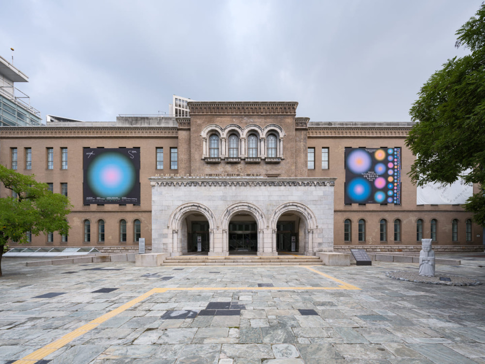
Color Manifesto for the 13th Seoul Mediacity Biennale

Color Manifesto
for the 13th Seoul Mediacity Biennale
Category Essay
Edition The 13th Seoul Mediacity Biennale
Authors Anton Vidokle, Hallie Ayres, Lukas Brasiskis, Sanna Almajedi, Ben Eastham, nonplace studio, and COLLECTIVE
Color is not secondary.1
We reject the assumption that color is supplementary, decorative, or merely aesthetic.
In this exhibition, color is foundational.
It shapes structure, logic, orientation, and experience.
It’s a primary artistic, architectural, and curatorial tool.
We reject the neutral space.2
The language of the contemporary art space: white walls, gray floors, minimal design, etc., conceals its own values, which could be defined along the lines of detachment, control, and homogeneity.
We oppose this erasure and the authority it projects.
Color is a medium of experience.3
Color communicates directly, before language.
It produces affect, creates memory, and organizes attention.
It allows for the emergence of thematic relations that are not reliant on chronology, category or geography.
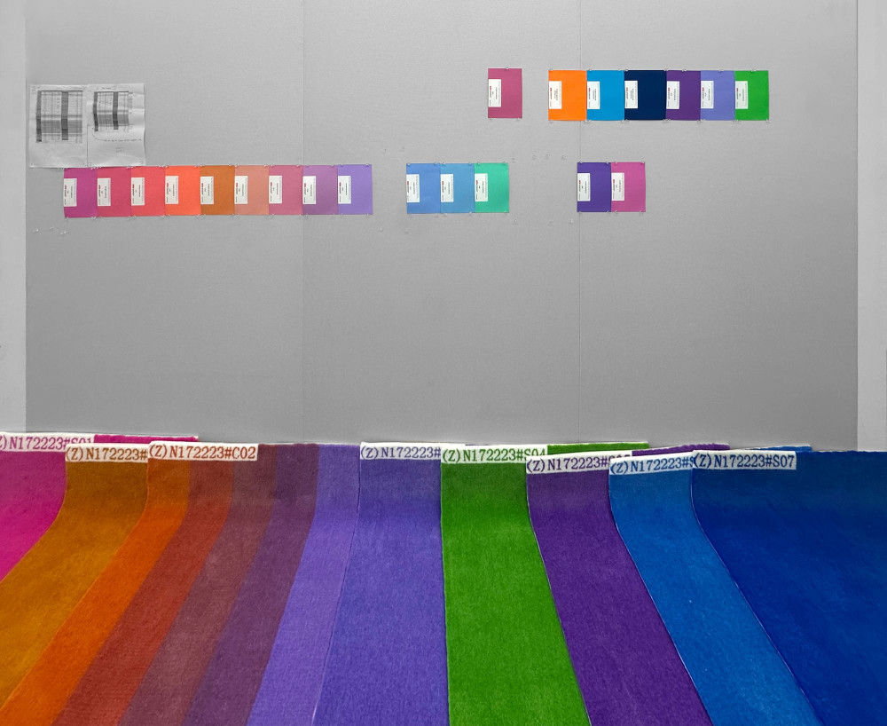
We use color to organize the exhibition.4
The layout of this biennale is not based on typologies, disciplines, or genres.
It is structured by chromatic and thematic zones.
These zones cluster works by resonance and shared orientation.
Magenta, green, violet, and blue function as spatial propositions: not symbols, but territories.
Gradients replace transitions.5
Rather than separating ideas by hard divisions, we allow them to shift, blend, and bleed.
Color gradients signal permeability.
Conceptual boundaries are treated as thresholds, not enclosures.
Color is political.6
The subordination of color to form, and of sensation to reason, mirrors broader systems of exclusion: colonial, patriarchal, rationalistic, or technocratic.
To center color is to challenge these systems–to refuse neutrality and hierarchy.
There is no such thing as “pure” color.7
Color is temporal and unstable.
Perception changes with time of day, light conditions, and duration of viewing.
No two visitors encounter the same colors in the same way.
This instability is part of the exhibition’s logic. It invites attention and presence.
Color is embodied.8
The exhibition is not only visual but is navigated by visitors.
Color becomes a spatial experience that directs movement and generates atmosphere.
Visitors do not simply observe color; they move through it.
Color is therapeutic.9
Color affects the nervous system: it modulates energy, attention, and emotion.
Color is used in healing rituals involving chromotherapy, stained glass, mineral pigments, and sacred architecture.
In this exhibition, color does not cure, but it offers conditions for rebalancing and recalibration.
Color is not institutional.10
The use of color is not merely graphic identity.
It’s not decoration or mood. Nor should it reify conventional exhibition space.
It’s an epistemological decision: to think through sensation, relation, and material perception.
Color is the structure.11
It does not frame the exhibition: it constitutes it.
In this exhibition, color is what connects works, defines space, marks transitions, and produces meaning.
It’s not applied: it’s integral.
– Anton Vidokle, Hallie Ayres, Lukas Brasiskis, Sanna Almajedi, Ben Eastham, nonplace studio, and COLLECTIVE
August 2025
-
Wassily Kandinsky, in Concerning the Spiritual in Art (1911), argued that color is a direct agent of inner experience. Each color, he claimed, possesses inherent emotional and spiritual effects, independent of representation. His work with the Bauhaus carried this principle into design and pedagogy, where color was treated not as surface but as a fundamental structural element of visual communication. ↩
-
Le Corbusier’s Polychromie Architecturale (1931/1959) reintroduced color as a functional component of architecture after decades of modernist suppression. He proposed a “color keyboard” to guide emotional and spatial experience, challenging the myth of the white cube’s neutrality. In parallel, artists like Theo van Doesburg and movements like De Stijl proposed primary color as a spatial and metaphysical ordering principle, rather than mere surface. ↩
-
Rudolf Steiner, founder of Anthroposophy, taught that color possesses moral and spiritual dimensions. He believed that different hues vibrate with distinct qualities of the soul, which could be cultivated through artistic practice, education, and environment. In his painting and architectural instructions, color was a medium for inner development and a conduit of cosmic order. ↩
-
At the Bauhaus, color was used to reorganize how people understand space and meaning. Figures like Josef Albers emphasized relational perception: color changes depending on its context, creating illusions of transparency, depth, or motion. Meanwhile, architects such as Hinnerk Scheper developed chromatic spatial systems that shaped how people would move and feel within built environments. ↩
-
Traditional non-Western color systems, such as Indian rasa theory, Chinese wu xing (five elements), and Japanese kasane no irome (seasonal layering), treat color as relational and symbolic—tied to time, cosmology, or emotion. In many African cultures, color operates as a communicative and spiritual code: Kongo cosmograms, Yorùbá orisha color pairings, and Zulu beadwork all use color to signal identity, divine presence, or social relations. These systems emphasize gradation, interdependence, and function, not fixed hue, or pure form. Color is not aesthetic but is cosmological, linguistic, and operational. ↩
-
Annie Besant and C.W. Leadbeater, writing in Thought-Forms (1901), theorized that thoughts and emotions emit colored energetic forms visible to trained clairvoyants. These color-forms had specific spiritual and emotional meanings: anger, for instance, might appear red-black, while aspiration appeared pale violet. Their theosophical system had wide influence on early modernist artists, including Kandinsky, Mondrian, and af Klint. ↩
-
Johann Wolfgang von Goethe’s Theory of Colours (1810) proposed that color arises not from objective wavelengths alone, but through the dynamic interaction of light and darkness as perceived by the eye. He emphasized the subjectivity and variability of color perception: how atmospheric, emotional, and physiological conditions influence what is seen. For Goethe, color is not static but experiential, shifting with context and attention. ↩
-
In anthroposophical and tantric architectural traditions, color is used not for ornamentation but as a spatial force that calibrates mood, perception, and behavior. In these systems, people do not simply view color: they are affected by it, physiologically and spiritually. The viewer’s movement through space becomes a form of embodied cognition shaped by chromatic cues. ↩
-
Color therapy, or chromotherapy, has ancient roots in Ayurvedic, Egyptian, and Islamic healing systems, where colors correspond to organs, temperaments, and energies. In Korean traditions, Obangsaek assigns five cardinal colors (blue/green, red, yellow, white, black) to elements, seasons, and directions. These colors appear in ritual architecture (dancheong), clothing, and shamanic practices as tools for balance, protection, and energetic alignment. In 20th-century esoteric movements such as Theosophy and Anthroposophy, color was further developed as a means of healing perception, attention, and inner life. ↩
-
Color as “visual identity” is a recent invention tied to marketing and institutional branding. In contrast, early 20th-century avant-gardes, including the Bauhaus and Suprematists, treated color as a generator of form, perception, and meaning. Today, a similar structural use of color persists in certain non-Western ritual architectures, where color organizes space according to cosmological or energetic systems. ↩
-
Yves Klein’s “International Klein Blue” (IKB) was not just a signature color but a proposition that color could exist independently of form, as a presence. Klein treated color as an event: an immaterial substance that shapes perception. His work reframed color as a carrier of meaning and sensation in itself. ↩